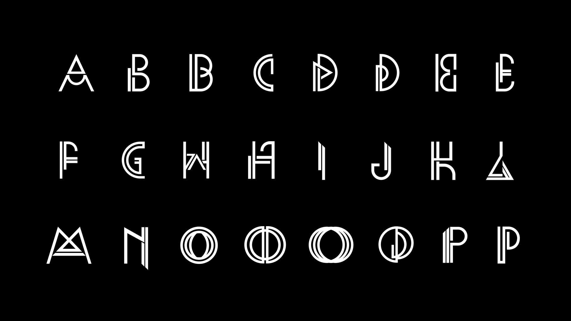
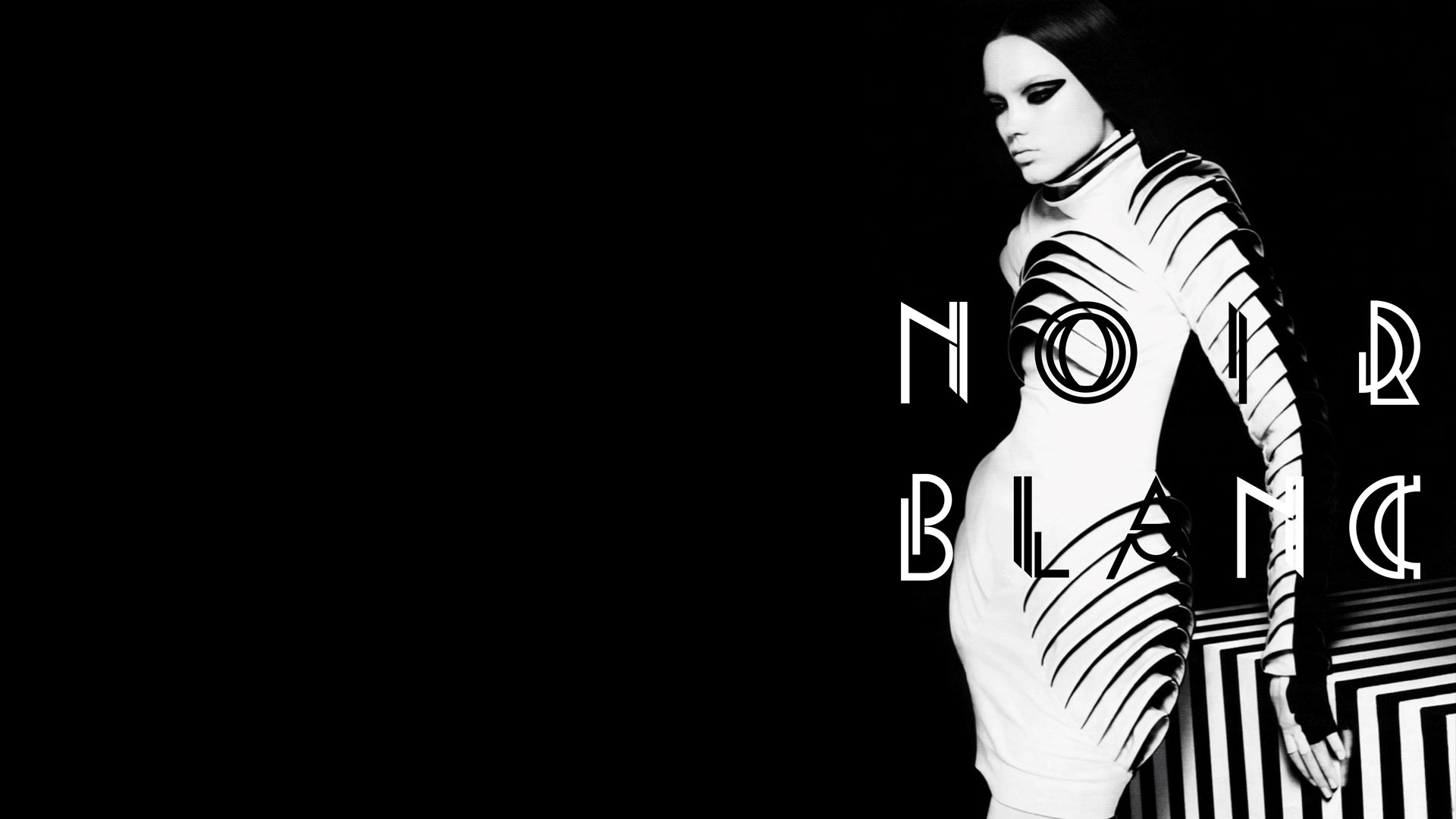
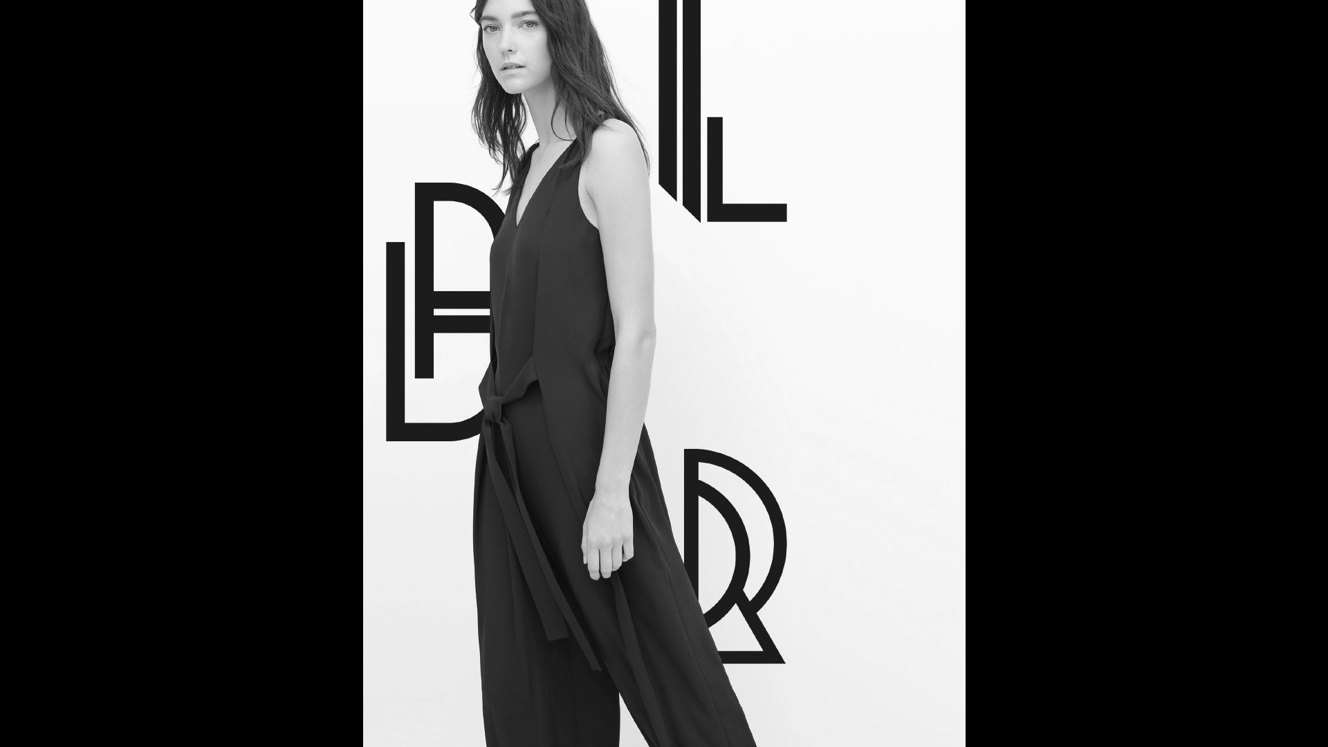
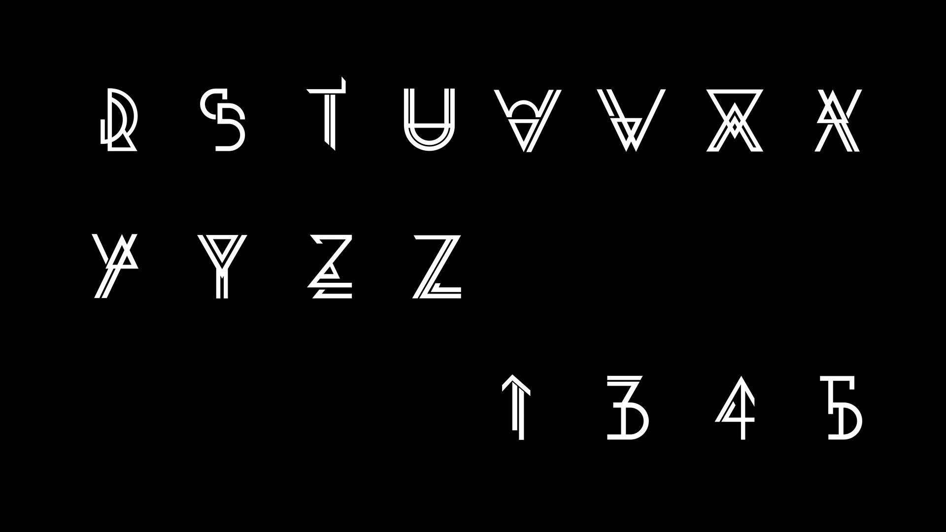
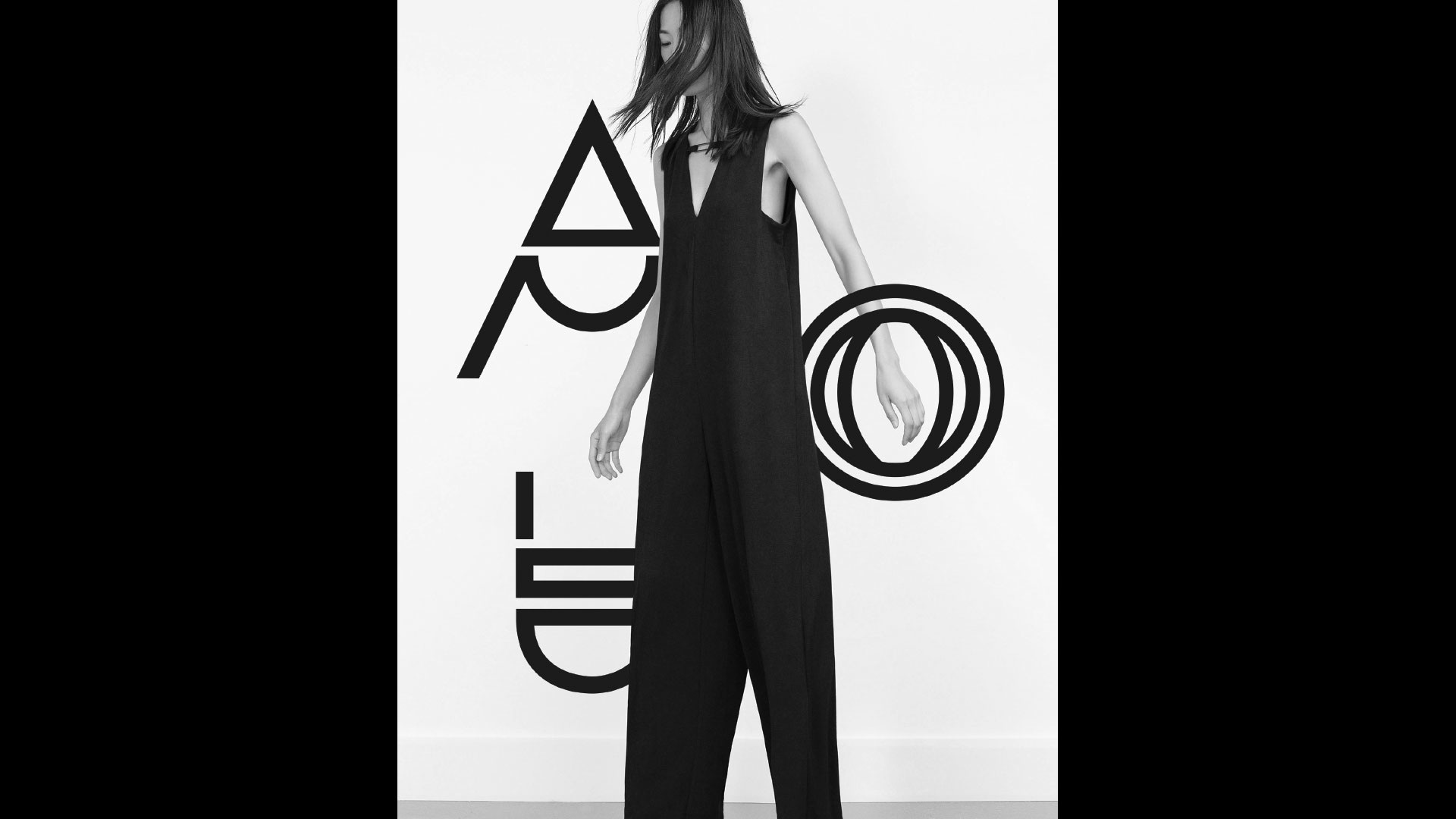
NOIRE
Font designed for Studio Blup London.
Each character can be used as a stand-alone logo
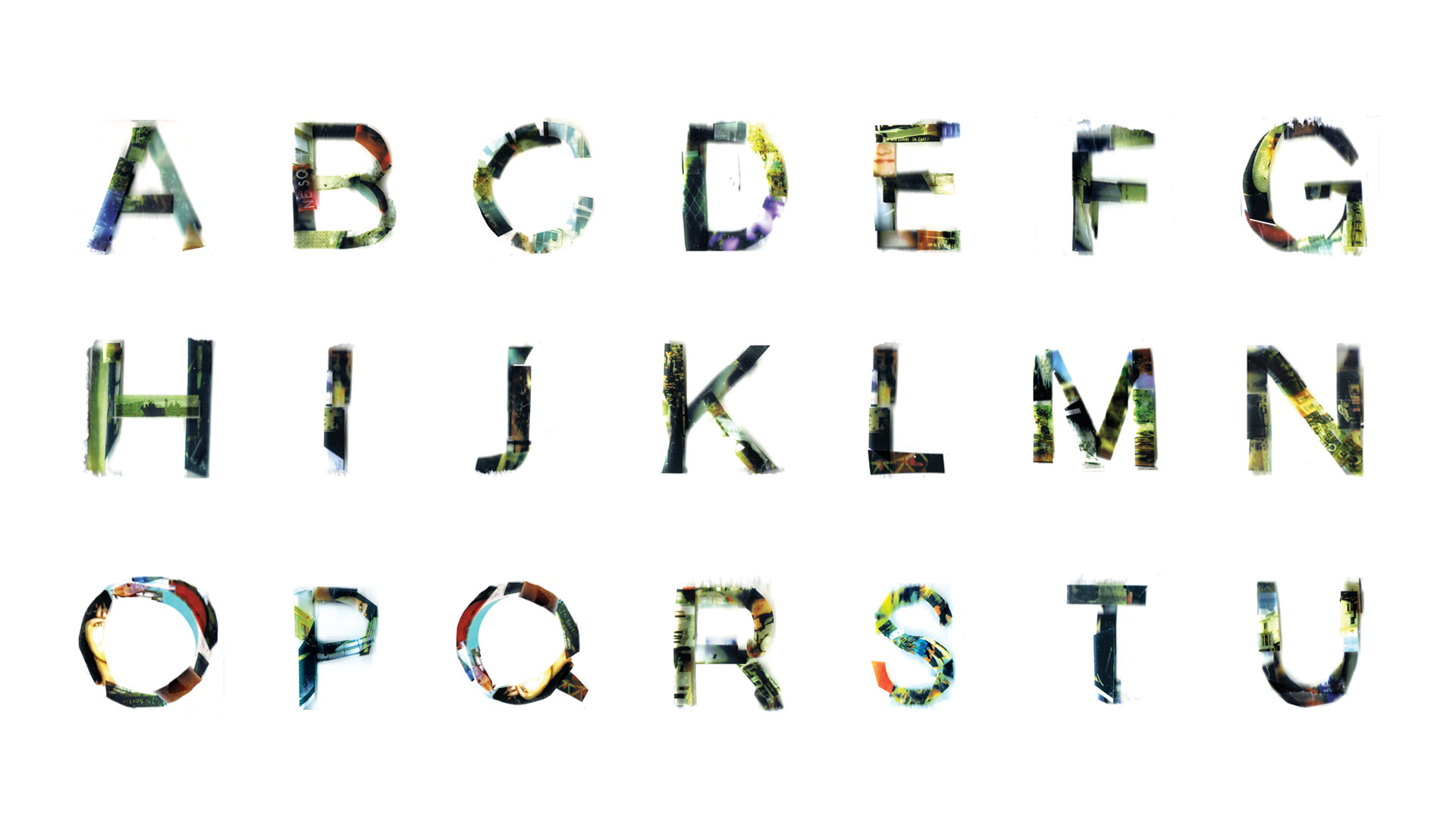
AUTOCHROME
Font for the photography department of La Cambre. Personal photographs printed on adhesive film and superimposed on different layers of Plexiglas.
The Autochrome Lumière is an early color photography process. Patented in 1903 by the Lumière brothers, the medium consists of a glass plate coated on one side with a random mosaic of microscopic grains of potato starch dyed red-orange, green, and blue-violet which act as color filters.
We redesigned the logo of the Parcours d’Artistes, an art and design festival in Brussels, using mirror shards. This technique enables the city to reflect in the typography and being a part of the poster as the festival focus on the journey one can make within the Saint-Gilles area. A collaboration with Ly Thuy Kim Sa.


